Radar Charts
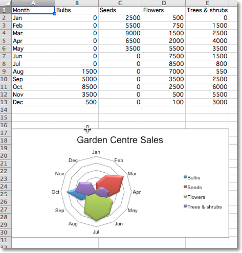
Data that is arranged in columns or rows on a worksheet can be plotted in a radar chart. Radar charts compare the aggregate values of multiple data series. It is effectively a projection of an area chart on a circular x-axis.
There are two types of radar chart: standard, where the area is marked with a line; and filled, where the whole area is filled. The additional type “marker” has no effect. If markers are desired these can be set for the relevant series.
from openpyxl import Workbook
from openpyxl.chart import (
    RadarChart,
    Reference,
)

wb = Workbook()
ws = wb.active

rows = [
    ['Month', "Bulbs", "Seeds", "Flowers", "Trees & shrubs"],
    ['Jan', 0, 2500, 500, 0,],
    ['Feb', 0, 5500, 750, 1500],
    ['Mar', 0, 9000, 1500, 2500],
    ['Apr', 0, 6500, 2000, 4000],
    ['May', 0, 3500, 5500, 3500],
    ['Jun', 0, 0, 7500, 1500],
    ['Jul', 0, 0, 8500, 800],
    ['Aug', 1500, 0, 7000, 550],
    ['Sep', 5000, 0, 3500, 2500],
    ['Oct', 8500, 0, 2500, 6000],
    ['Nov', 3500, 0, 500, 5500],
    ['Dec', 500, 0, 100, 3000 ],
]

for row in rows:
    ws.append(row)

chart = RadarChart()
chart.type = "filled"
labels = Reference(ws, min_col=1, min_row=2, max_row=13)
data = Reference(ws, min_col=2, max_col=5, min_row=1, max_row=13)
chart.add_data(data, titles_from_data=True)
chart.set_categories(labels)
chart.style = 26
chart.title = "Garden Centre Sales"
chart.y_axis.delete = True

ws.add_chart(chart, "A17")

wb.save("radar.xlsx")

